Completing the Journey
Michael Pilkington
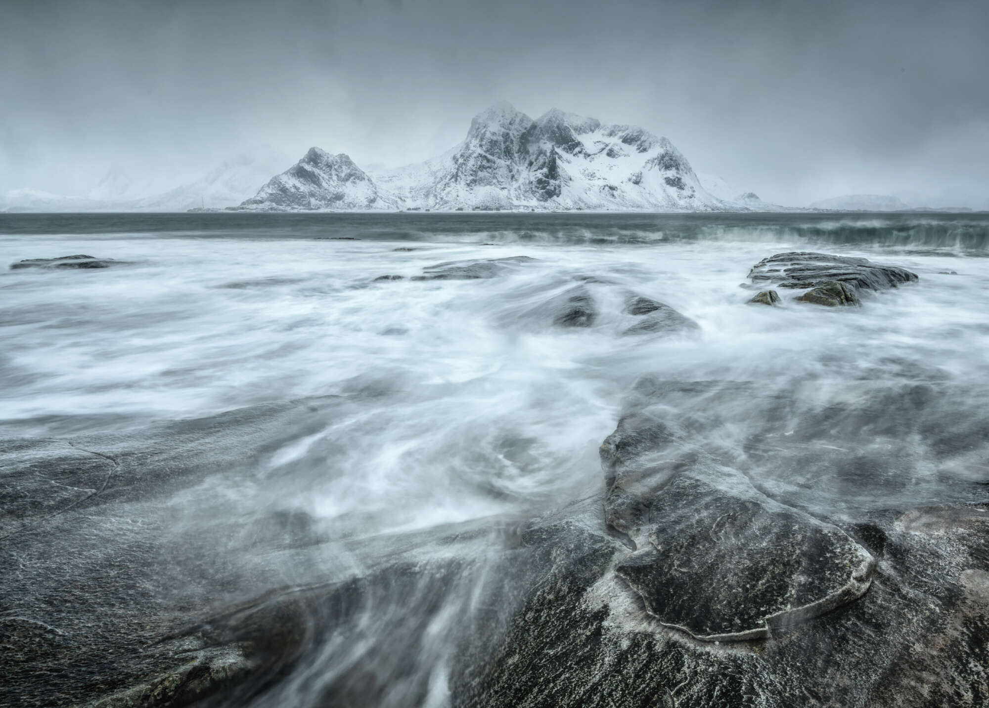
I have the good fortune to travel to many places around the world. I also spend time nearer to home exploring the local landscape, mainly trees and woodlands which is a genre I love, especially in infrared which opens up more opportunities than colour and black and white. When I return home, I may have a few images or many if I have been away for an extended period of time. I don’t make that many exposures in the field. I like to visualise the landscape in front of me and imagine the finished photograph in a print, mounted and framed and hanging on a wall. If I can’t imagine that outcome or I don’t think it will work, then I won’t make the exposure. An image that is to be printed and given the honour of being framed has to meet certain criteria, such as visually stimulating, represents the moment I experienced whilst making the exposure, and mean something to me personally, an emotional connection. I suppose I am very demanding and critical of my own work and know from many years of experience what is likely to work and what I will deem as mediocre. That is not to say that I don’t experiment with new ideas and techniques. Sometimes you can have a RAW file that you did not have many expectations of which delivers some quite exceptional results
In general, though, I am excited in the anticipation of seeing the RAW file on the ‘big screen’. It is then that you can truly evaluate what you have captured. If you are fortunate you will immediately be excited by what you see. Often, you have to work your way through the image to reveal the somewhat hidden treasure within. You have to nurture the file to recover the light, to re-establish the shadows and highlights in their correct proportions and create balance, recreate what you saw. Sometimes though this can result in arriving at a dead end. The potential that you anticipated in the field is not to be and your mind’s eye has outwitted you with reality versus expectation. However, being selective in the field, previsualizing what can be, carefully managing the exposure and allowing yourself to connect emotionally with the environment you are in often reaps rewards.
It is this process, back at your computer, using your image editing software of choice that is just as important as being in the field. It is the other half of the photographic journey, indeed, the completion of the journey. Imagine the creation of a house. The architect can prepare the drawings and create 3D mock ups, the materials for its construction can be procured, but is not until the house is built that its true majesty, its presence, its identity is wholly revealed. In photography, this is post processing and printing and it is something that many photographers do not enjoy as much as being out there with their cameras capturing the image. Having worked with many photographers in my career, post processing is often described in negative terms as a necessary evil to be over and done with and certainly one laced with complexity and frustration. It is clear from conversations with photographers that confidence in what and how to use programmes like Lightroom and Photoshops is the main rationale behind this opinion and the failings that ultimately result in using them.
Equally, they may not have been so discerning the field so that they cannot completely recall why they took the image in the first place, the light, the atmosphere, the non-visual aspects such as the wind, scent, ambience. This disconnection from these critical aspects may result in the reliance on third party plug-ins that can offer a pre-packaged, ‘processed’ look and feel. It is simply a matter of scrolling through so many filters until one looks preferable or indeed just looks like an improvement from the raw file. To use another analogy, it is like buying flat packed furniture from IKEA versus having something created by a carpenter. Carpenters are extremely skilled people because they have taken the time to learn their craft and the tools they use. They can instinctively reach for the right tool to progress the task in hand and to achieve the polished, refined or delicate look they are after. They have practiced their craft over many years encountering different situations, some straight forward and others challenging demanding that they stretch and develop their skills. The same applies to photography. Knowing the tools that we have at our disposal and their capabilities to such a degree that you are fluent in their use means that they do not require conscious thought. You can give your full attention to the creative aspects of creating your finished photograph.
Post processing is not quite the end of the story though. The real destination for any photographer should be a finished print. Something that can be mounted, framed and hung on a wall or simply shared with friends and family or entering into a competition. The skills in producing a print are much more demanding than creating a finished image for digital display. A digital projection, by virtue of the medium itself will give luminosity and vibrance to the image. Achieving this in a print is much more difficult and much more demanding. Fundamentally, paper reflects light and is a much more muted cousin to an image viewed on a computer monitor. Some media struggles to differentiate darker tones and shadow details can get absorbed and may block out. Similarly, highlights may not render well. There is no white ink in a printer and the lightest tones inherit their colours and luminance from the paper itself. Lastly, the gamut (the range of colours) of any paper will be far less than that of a good quality computer monitor. With so many obstacles to success, it is little wonder that many photographers do not choose to print. For those that do, it can be a frustrating and annoying process.
Choosing what paper to print on is an important consideration. There are a multitude of different manufacturers and media available to us. The principal considerations for choosing media for us photographers will be the thickness and weight of the paper and the surface finish and tone.
The Fine Art Guild under its ‘Art Sure’ scheme publishes a list of media and equipment that meet its standards for digital printing that endeavour to give assures on lightfastness, acidity of substrates, minimum weight and inks (generally speaking these are the manufacturer’s own inks). This is a good place to select candidate papers that you might want to work with. Having selected some prospective papers, you should get to know how they perform. For example, some might be better suited to a limited palette of colours, some may struggle to reveal shadow detail in black and white prints, etc. Most papers will require some adjustments to your fully post processed and finished image to accommodate their limitations. It is better to work with a small number of papers so that you can become familiar with their characteristics and how they behave. I tend to work with and a soft gloss or lustre paper and two matte papers (one bright white and the other natural, one smooth and one textured. Each of these offers different characteristics. Firstly, the soft gloss is Epson’s Traditional Photo Paper. It works well with both black and white as well as colour images and is excellent at reproducing a good range of colours as well as managing to reveal good detail in shadows. Just about any image I have will print well on this paper. The two matte papers are used when I want a ‘painterly’ effect and have an image with a more limited palette of colours and subtle tones. My preferences are for, again by Epson’, Fine Art Cotton Smooth Bright and Fine Art Cotton Smooth Natural. The ‘Natural’ paper has a creamy colour to it as opposed to the ‘Bright’ which is white. As mentioned before, the colour of the paper has an impact on apparent luminosity and the lighter tones in the image. Textured paper will add to the impression of a fine art painting.
If you are going to print, it is worthwhile to invest properly in the media and inks you are using. It can be quite surprising the difference between a paper that costs £2 per sheet and one double that. The more expensive paper will generally reproduce colours more accurately, also having a wider gamut, appear sharper and reveal the delicacy of shadow and highlight details. Photographers can be shy of using ‘expensive’ paper and inks being concerned with the costs associated with failure. However, it is important to put this into context. Often, a photographer will have thousands of pounds of camera equipment and accessories to capture the image, they may have invested hundreds, if not thousands of pounds, journeying to the location they have photographed often never considering these costs in relation to the comparatively measly sum of making a print. Furthermore, most photographers will only print a few of their images per month, if that. So overall, the cost of media and ink is not really that great. It has been the cumulative phycological effect of being informed for many years that inks are overpriced that has led to many photographers never really getting over the finishing line.
In summary, for me, printing is a joyous activity and the process of making the print is deeply satisfying. It feels like a trophy well earned. As the print emerges from the printer, millimetre by millimetre, you are filled with anticipation. Will the colours be correct? How are those shadows? Did I make the necessary and sufficient adjustments for the chosen media? As the completed print completes its birth from the printer you gaze upon the full majesty of the image. The image that you perhaps travelled far overseas to capture, that you got up at some Godforsaken hour to arrive in good time for the sunrise, that you set up your camera and assembled the correct filtration for, that you have carefully post processed and prepared for its final incarnation as a print. This is the end of the journey, the journey truly completed.