
Working in another light
Article
Michael Pilkington
Ironically, one of the things I don’t like about infrared photography is that leaves and foliage are represented as white. Indeed, an image can be overwhelmed by the infrared effect, highlights and whites dominating. I have usually been attracted to images that subtly show infrared light. I spent many years suppressing the effects of infrared brightness in my prints. Strange behavior I know! This all changed one Christmas. A client of mine sent out a Christmas card of a scene which was actually taken in the summer in infrared. Obviously, the scene was very white. Looking at his image it could easily have been a snow covered landscape. I was very impressed and was moved to revisit some of my files which I had neglected to post process.
"This experience taught me one thing and that was to embrace the full effects of infrared"
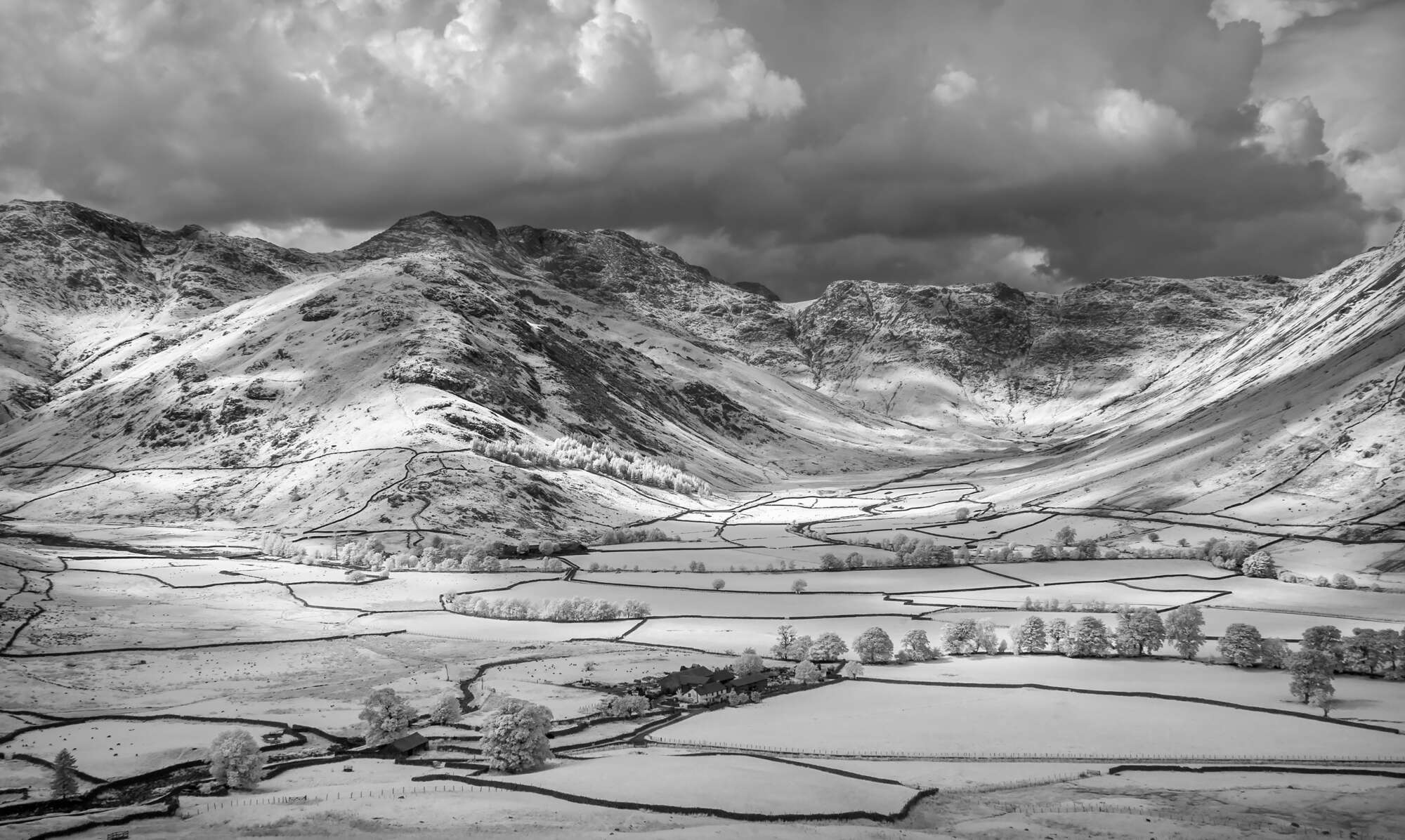
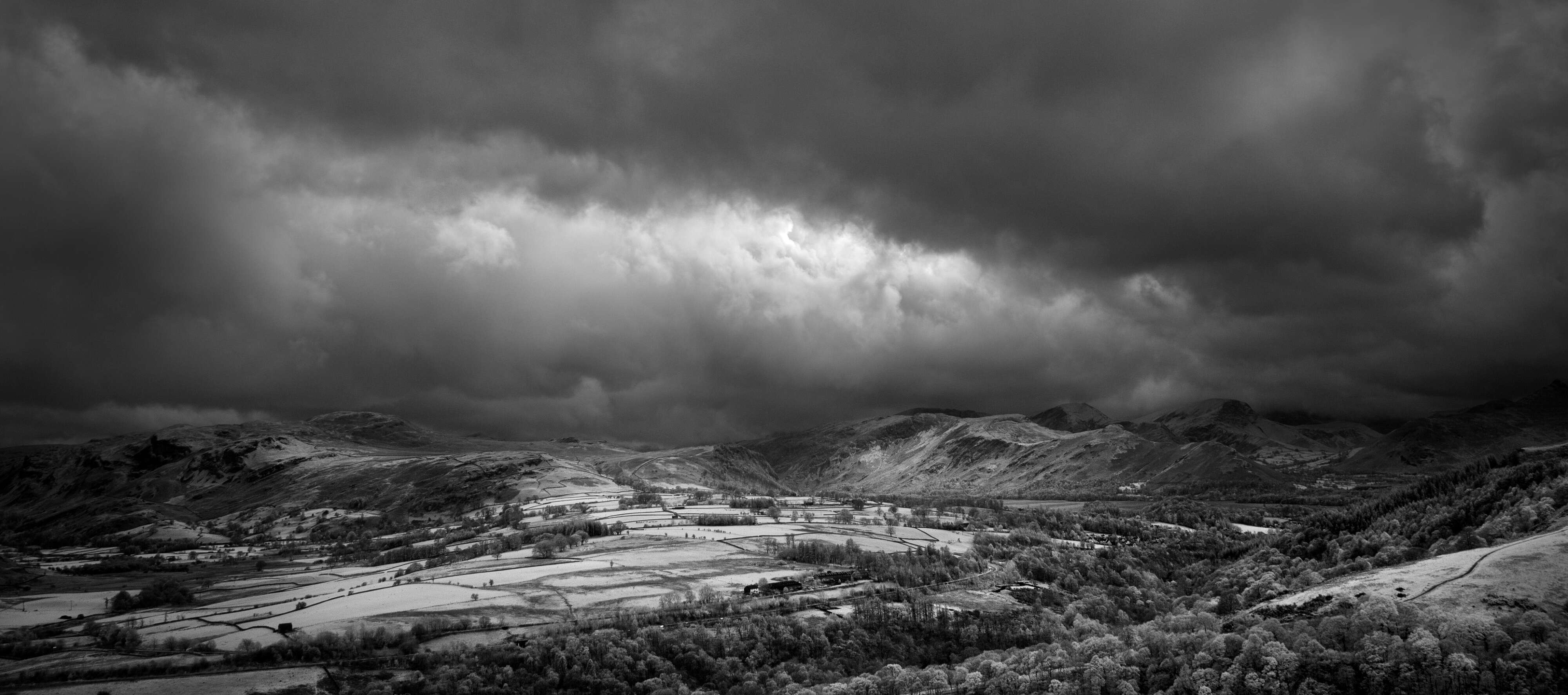
The image above, of the Langdale Valley in the Lake District, had been taken a couple of years earlier. I was particularly attracted to the clouds and the shadows they cast upon the landscape. These shadows provided tonal variation and visual recession. I was very pleased when I had finished processing this file and had printed it. This experience taught me one thing and that was to embrace the full effects of infrared. I still prefer subtler images but always look to ensure that the effects of infrared have their rightful place in my images. This is a lesson that I share with the many people I have taught infrared photography over the years. It is not uncommon to shy away from what can be seen as the garish effects of infrared in an image. However, treated sympathetically, it can still dominate an image and be pleasing to the eye.

